#designsystem
#web
#Figma

Problem
Having an outdated interface for the login system resulted in a suboptimal user experience due to high friction. This friction not only complicated the login process but also caused frustration among users, potentially leading to lower retention and customer satisfaction. Additionally, the interface did not adequately utilize the screen width, as it was designed in a portrait format, which was not optimal for most modern devices that use wider horizontal screens.
The process for the new design.

Research & Benchmarking
We started looking for market references that offered multiple login methods. However, we found very few options that aligned with what we had in mind. As a result, we decided to create a "chooser"-style interface for selecting verification methods.
Analysis
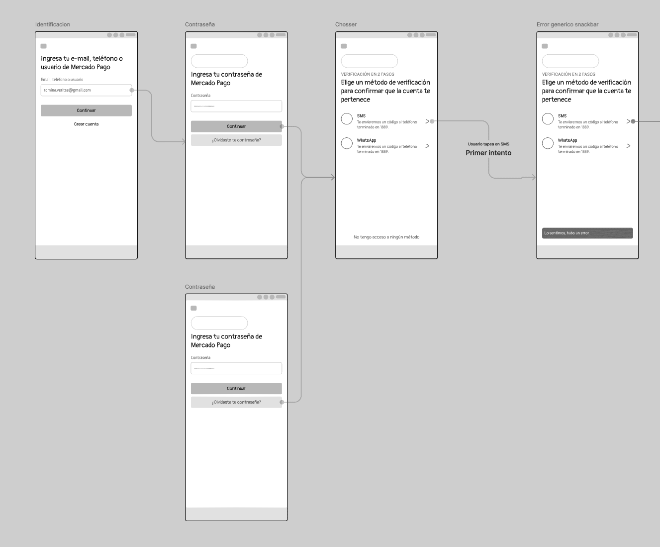
We began working on mobile wireframes, exploring the initial iterations of the chooser interface.
Solution
Updating the login interface to be more modern and adaptable to different screen sizes and orientations can significantly improve the user experience. A more intuitive and visually pleasing interface not only reduces friction but also enhances the perception of the service and facilitates quicker and more efficient access. These changes are crucial for staying competitive in a market where user experience is key to success and customer loyalty.
I must mention the many people who participated in this process along with me, such as Lucas Panichella, Afri Aspeleiter, and Agustina Haydee.


